
In the high-stakes world of corporate leadership, your visual identity often speaks before you do. We like to think that our expertise and track record are the only things that matter, but the reality is that “executive presence” is a multi-sensory experience. It’s the way you command a room, the way you listen, and, perhaps most subtly, the way you present yourself through your wardrobe. Professional office attire isn’t just about following a dress code; it’s a strategic tool. When you master the art of color selection, you aren’t just getting dressed—you’re calibrating your influence.
The challenge most modern professionals face is finding the balance between tradition and personal brand. We’ve moved past the era of the “uniform,” yet the sheer volume of choices can be paralyzing. Whether you are stepping into a boardroom or leading a creative workshop, the colors you wear send specific psychological signals. This guide is designed to help you navigate those signals, helping you build a wardrobe that feels authentic, commandingly professional, and effortlessly modern. By the end of this journey, you’ll understand how to use a color palette to reinforce your authority and project the exact level of professionalism your role demands.
Navigating the Landscape of Industry Expectations
Before we dive into the psychology of specific hues, we have to acknowledge that “professionalism” looks different depending on where you sit. A partner at a prestigious law firm in London operates under a different visual vocabulary than a tech founder in Silicon Valley or a creative director in Milan. The first step in mastering your palette is identifying the baseline expectations of your specific industry.
In traditional sectors like finance, law, and high-level consulting, the palette remains rooted in “power colors”—deep navies, charcoal grays, and crisp whites. These colors are synonymous with stability, reliability, and history. However, in more modern or creative sectors, a strictly monochrome approach can actually backfire, making you appear rigid or out of touch. In these environments, the palette shifts toward “approachable authority,” utilizing earth tones, muted teals, and sophisticated olives. Understanding these unwritten rules allows you to decide when to lean into tradition and when to strategically break it.
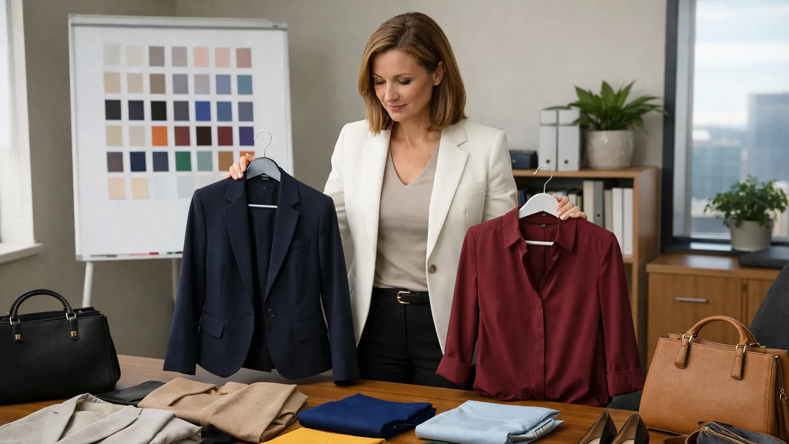
The Hidden Psychology of Your Daily Palette
Every color carries an emotional weight that influences how others perceive your mood and competence. Navy blue is perhaps the most universally trusted color in the professional world; it suggests intelligence and calm without the starkness of black. Charcoal and mid-gray, meanwhile, project a sense of analytical maturity and balance. If you want to be seen as the “steady hand” during a crisis, these are your go-to shades.
Conversely, the use of white and light blue in shirts and blouses communicates cleanliness, precision, and openness. When we move into bolder territory, the stakes get higher. A deep burgundy or plum can convey wealth and sophistication, while a sharp forest green suggests growth and vitality. The key is to match the hue to the objective of your day. Are you there to negotiate a tough contract? Lean into the strength of dark neutrals. Are you there to inspire a team? Perhaps a touch of a warmer, more inviting accent color is in order.
Building Your Foundation with Neutral Professional Office Attire
The secret to a versatile, high-end wardrobe is the “Neutral Base.” Think of these as the canvas upon which your executive presence is painted. For most, this means investing heavily in high-quality suits, trousers, and blazers in four key shades: Navy, Charcoal, Black, and Camel (or Sand).
By establishing these neutrals as your foundation, you simplify the decision-making process. These colors are inherently professional and incredibly easy to mix and match. A charcoal blazer works just as well with navy trousers as it does with dark denim for a business-casual Friday. When you start with a neutral base, you avoid the common pitfall of having a closet full of “statement pieces” that don’t actually go together. It allows your face and your words to remain the focal point, rather than a distracting pattern or an overly bright fabric.
The Art of Strategic Accents and Texture
Once the foundation is set, the “modern” part of modern professionalism comes through your accents. This is where you inject personality and stay current without sacrificing gravitas. A strategic accent isn’t necessarily a bright neon tie or a vibrant scarf; it’s often a subtle shift in tone. For example, pairing a charcoal suit with a pale lavender shirt instead of the standard light blue adds a layer of contemporary sophistication.
Fabric texture plays a massive role here as well. Color looks different on different materials. A matte wool in navy looks authoritative and traditional, while a navy silk or high-twist cotton might look more modern and sleek. Mixing textures—like a crisp cotton shirt under a textured knit tie—adds visual depth. This “tonal layering” keeps an outfit from looking flat or dated. It shows an attention to detail that mirrors the precision you bring to your work.
Adjusting Professional Office Attire for the Seasons and Light
A master of executive style understands that their palette should evolve with the calendar. It’s not just about temperature; it’s about the quality of light. During the autumn and winter months, deeper, “heavier” colors like espresso, slate, and oxblood feel more appropriate and grounded. As we move into spring and summer, lightening your palette to include stones, light grays, and even subtle pastels reflects an energy of renewal and adaptability.
Furthermore, consider your environment’s lighting. Fluorescent office lights tend to wash out cooler tones and can make certain grays look sickly. If you spend most of your time in a traditionally lit office, leaning toward warmer neutrals (like a rich chocolate brown or a warm navy) can help you maintain a healthy, vibrant appearance. Conversely, if you work in a modern space with plenty of natural light, you have more freedom to experiment with cooler, sharper contrasts.
Practical Steps for Refining Your Professional Image
Transforming your wardrobe doesn’t require a total overhaul overnight; it’s a process of refinement. Start by auditing your current closet and identifying which “base” color you gravitate toward most. Once you identify your primary base, you can begin to add “bridge” pieces that allow you to transition between different levels of formality.
-
Focus on Fit Over Everything: Even the most expensive color palette will fail if the tailoring is off. Ensure your base layers—blazers and trousers—are tailored to your current frame.
-
The 70/30 Rule: Aim for 70% of your outfit to be comprised of your neutral base, with 30% reserved for your accent colors and accessories. This maintains a professional “weight” while allowing for personality.
-
Standardize Your Accessories: To maintain visual cohesion, choose a leather tone (brown, tan, or black) and a metal tone (silver or gold) and stick to them. Mixing a black belt with brown shoes breaks the visual line.
-
Audit Your “Face” Colors: Hold different shirts up to your face in natural light. Some colors will make your skin look bright and rested, while others will highlight shadows.
The Lasting Impact of Visual Consistency
Ultimately, mastering your executive presence through color is about reducing “friction.” When your professional office attire is consistently put-together, it removes one more variable from the professional equation. People stop wondering if you’re “up for the job” based on your appearance and start focusing entirely on the value you provide.
A well-chosen color palette is a silent partner in your career. It builds a brand of reliability, sophistication, and attention to detail. As you move forward, remember that your clothes are an investment in your most important asset: yourself. Take the time to curate a palette that reflects the leader you are—and the one you are becoming.